
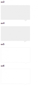
三角形はborderの組み合わせで作成します。また、オブジェクトを1px動かして、枠線を消すテクニックを使います。
<!DOCTYPE html>
<html lang="ja">
  <head>
   <meta charset="utf-8">
   <title>CSS Layout practice</title>
   <link rel="stylesheet" href="normalize.css">
   <!-- <link rel="stylesheet" href="reset.css"> -->
   <link rel="stylesheet" href="styles.css">
   <style>
   body {
    padding: 0 10px 40px;
   }
   h2 {
    font-size: 16px;
   }
   .ex1 {
    width: 100px;
    height: 100px;
    background: #eee;
   }
  .ex2 {
    width: 100px;
    height: 100px;
    background: #eee;
    border-style: solid;
    border-width: 20px;
    border-color: red blue pink green;
   }
    .ex3 {
    width: 200px;
    height: 100px;
    background: #eee;
    border-radius:3px;
    position: relative;
   }
    .ex3:before {
    position: absolute;
    right: 20px;
    bottom: -20px;
    content: '';
    width: 0:
    height: 0;
    border-style: solid;
    border-width: 10px;
    border-color: #eee transparent transparent transparent;
   }
  .ex4 {
    width: 200px;
    height: 100px;
    background: #eee;
    border-radius:3px;
    position: relative;
   }
    .ex4:before {
    position: absolute;
    right: 20px;
    bottom: -20px;
    content: '';
    width: 0:
    height: 0;
    border-style: solid;
    border-width: 10px 20px 10px 0;
    border-color: #eee transparent transparent transparent;
   }
   .ex5 {
    width: 200px;
    height: 100px;
    border: 1px solid #eee;
    border-radius:3px;
    position: relative;
   }
    .ex5:before {
    position: absolute;
    right: 20px;
    bottom: -20px;
    content: '';
    width: 0:
    height: 0;
    border-style: solid;
    border-width: 10px;
    border-color: #eee transparent transparent transparent;
   }
       .ex5:after {
    position: absolute;
    right: 20px;
    bottom: -19px;
    content: '';
    width: 0:
    height: 0;
    border-style: solid;
    border-width: 10px;
    border-color: white transparent transparent transparent;
   }
     .ex6 {
    width: 200px;
    height: 100px;
    border: 1px solid #eee;
    border-radius:3px;
    position: relative;
   }
    .ex6:before {
    position: absolute;
    right: 20px;
    bottom: -20px;
    content: '';
    width: 0:
    height: 0;
    border-style: solid;
    border-width: 10px 20px 10px 0;
    border-color: #eee transparent transparent transparent;
   }
       .ex6:after {
    position: absolute;
    right: 20px;
    bottom: -19px;
    content: '';
    width: 0:
    height: 0;
    border-style: solid;
    border-width: 10px 20px 10px 0;
    border-color: #fff transparent transparent transparent;
   }
   </style>
  </head>
<body>
  <h2>ex1</h2>
  <div class="ex1"></div>
  <h2>ex2</h2>
  <div class="ex2"></div>
    <h2>ex3</h2>
  <div class="ex3"></div>
      <h2>ex4</h2>
  <div class="ex4"></div>
  <h2>ex5</h2>
  <div class="ex5"></div>
    <h2>ex6</h2>
  <div class="ex6"></div>
</body>
</html>