SVGとは
– XMLをベースにした二次元ベクターデータ
SVGのメリット
– 拡大・縮小に強い
– 軽い
– CSSで装飾させたりアニメーションも可
デメリット
– 写真やイラスト等に向かない
### SVG作成
まずPhotoshopでSVG画像を作ります
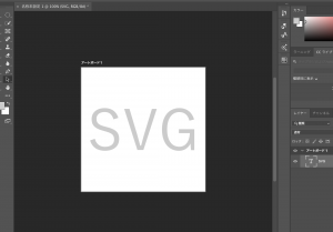
あれ、保存できない。。
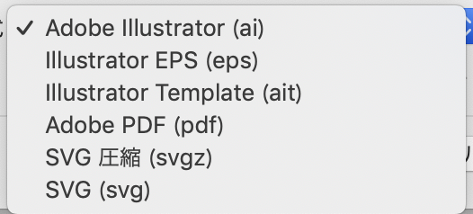
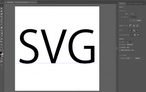
というか、SVGはillustratorで作るらしい。 なるほど。。。。
気を取り直して、illustratorで画像を作ります。
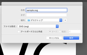
保存した状態
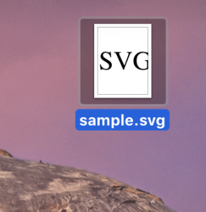
sublimeに当ててみると。。。
<?xml version="1.0" encoding="utf-8"?>
<!-- Generator: Adobe Illustrator 23.0.1, SVG Export Plug-In . SVG Version: 6.00 Build 0)  -->
<svg version="1.1" id="レイヤー_1" xmlns="http://www.w3.org/2000/svg" xmlns:xlink="http://www.w3.org/1999/xlink" x="0px"
	 y="0px" viewBox="0 0 500 500" style="enable-background:new 0 0 500 500;" xml:space="preserve">
<style type="text/css">
	.st0{fill:none;}
	.st1{font-family:'KozGoPr6N-Regular-83pv-RKSJ-H';}
	.st2{font-size:261px;}
</style>
<rect x="14" y="106.68" class="st0" width="478" height="269.86"/>
<text transform="matrix(1 0 0 1 14 336.3662)" class="st1 st2">SVG</text>
</svg>
ほう、こんなんなってるのか。
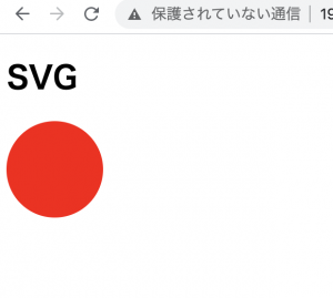
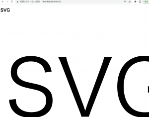
	<h1>SVG</h1>
	<img src="/img/sample.svg">
### css表示
<div class="test"></div>
.test {
	background-image: url("img/sample.svg");
}
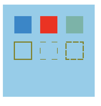
– fill, fill-opacity, stroke, stroke-width, stroke-dasharray, stroke-dashoffsetなど使用可能
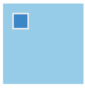
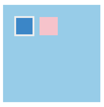
### objectで表示
<object type="image/svg+xml" data="/img/sample.svg" width="200" height="100"></object>
### fillの例
	<svg id="test" xmlns="http://www.w3.org/2000/svg">
		<circle class="icon" cx="50" cy="50" r="50"/>
	</svg>
#test {
	fill: red;
}