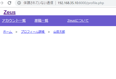
まずhtml
<!-- パンくず -->
    <ul class="breadcrumb">
      <li itemscope="itemscope" itemtype="http://data-vocabulary.org/Breadcrumb" >
        <a href="/top" itemprop="url">
          <span itemprop="title">ホーム</span>
        </a>
      </li>
      <li itemscope="itemscope" itemtype="http://data-vocabulary.org/Breadcrumb" >
        <a href="/top" itemprop="url">
          <span itemprop="title">プロフィール詳細</span>
        </a>
      </li>
    </ul>
    <!-- / パンくず -->
続いてcss
:before、content:none なんて書き方あるんですな。ひょえーーーーーーーーー
ul.breadcrumb {
	margin-left:10px;
}
ul.breadcrumb li{
	display: inline;
	margin-left: 10px;
	font-size: 12px;
}
ul.breadcrumb li:before{
	margin-right: 10px;
	content:" > ";
}
ul.breadcrumb li:first-child:before{
	content: none;
}
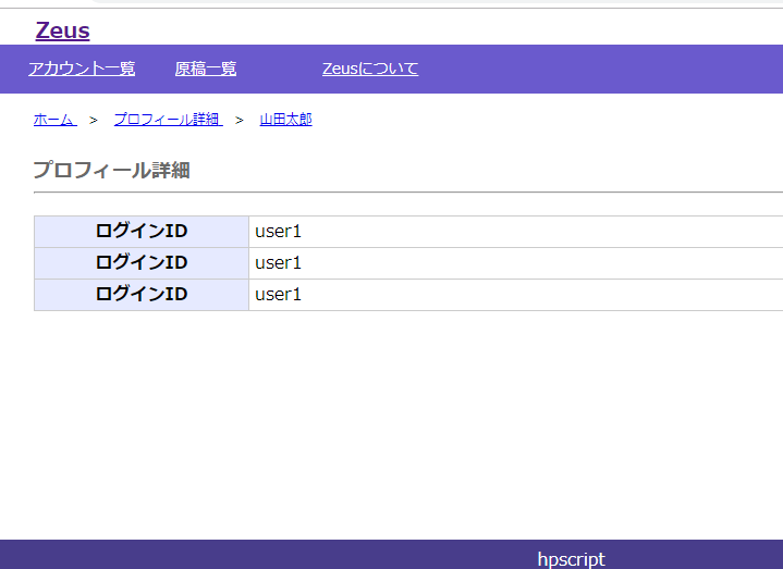
view
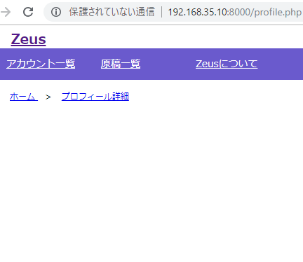
cssは触らずhtmlだけ編集します。
<!-- パンくず -->
    <ul class="breadcrumb">
      <li itemscope="itemscope" itemtype="http://data-vocabulary.org/Breadcrumb" >
        <a href="/top" itemprop="url">
          <span itemprop="title">ホーム</span>
        </a>
      </li>
      <li itemscope="itemscope" itemtype="http://data-vocabulary.org/Breadcrumb" >
        <a href="/top" itemprop="url">
          <span itemprop="title">プロフィール詳細</span>
        </a>
      </li>
      <li itemscope="itemscope" itemtype="http://data-vocabulary.org/Breadcrumb" >
        <a href="/top" itemprop="url">
          <span itemprop="title">山田太郎</span>
        </a>
      </li>
    </ul>
    <!-- / パンくず -->
ほーーーーーーーー