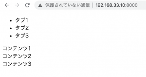
yahooトップのタブのように、クリックしてもページ遷移しないタブを作りたい。
### jQueryとCSSで作る場合
index.html
– jqueryの制御は後から書きます。
<!DOCTYPE html>
<html lang="en">
<head>
<meta charset="UTF-8">
<title>Document</title>
<link rel="stylesheet" href="styles.css" type="text/css">
<script
src="https://code.jquery.com/jquery-3.5.1.js"
integrity="sha256-QWo7LDvxbWT2tbbQ97B53yJnYU3WhH/C8ycbRAkjPDc="
crossorigin="anonymous"></script>
</head>
<body>
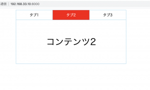
<div class="tab">
<ul class="tab-menu">
<li class="tab-item active">タブ1</li>
<li class="tab-item">タブ2</li>
<li class="tab-item">タブ3</li>
</ul>
<div class="tab-box">
<div class="tab-content show">コンテンツ1</div>
<div class="tab-content">コンテンツ2</div>
<div class="tab-content">コンテンツ3</div>
</div>
</div>
<script>
</script>
</body>
</html>
styles.css
* {
box-sizing: border-box;
}
ul, li {
padding: 0;
margin: 0;
}
li {
list-style: none;
}
.tab {
width: 500px;
max-width: 100%;
margin: auto;
}
.tab-menu{
display: flex;
}
.tab-item {
text-align: center;
padding: 10px 0;
cursor: pointer;
flex-grow: 1;
border-top: 1px solid skyblue;
border-left: 1px solid skyblue;
border-right: 1px solid skyblue;
}
.tab-item:not(:first-child){
border-left: none;
}
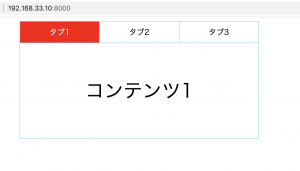
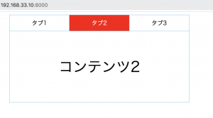
.tab-item.active {
background: red;
color: white;
}
.tab-box {
height:200px;
display: flex;
justify-content: center;
align-items: center;
border: 1px solid skyblue;
}
.tab-content {
display: none;
font-size: 40px;
}
.tab-content.show {
display: block;
}
jquery
– タブclick時にactiveとshowのclassをremoveして、clickされたタブのindexと同じindexにcontentのclassにshowを追加する
– タブとコンテンツの数、順番を一致させる必要がある
<script>
		$(function(){
			$('.tab-item').click(function(){
				$('.active').removeClass('active');
				$(this).addClass('active');
				$('.show').removeClass('show');

				const index = $(this).index();

				$('.tab-content').eq(index).addClass('show');
			})
		})
	</script>
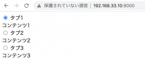
### CSSのみで作る場合
index.html
<div class="tab">
		<input id="menu1" class="tab-input" name="menu" type="radio" checked="checked">
		<label for="menu1" class="tab-item">タブ1</label>
		<div class="tab-content">コンテンツ1</div>

		<input id="menu2" class="tab-input" name="menu" type="radio">
		<label for="menu2" class="tab-item">タブ2</label>
		<div class="tab-content">コンテンツ2</div>

		<input id="menu3" class="tab-input" name="menu" type="radio">
		<label for="menu3" class="tab-item">タブ3</label>
		<div class="tab-content">コンテンツ3</div>
	</div>
* {
	box-sizing: border-box;
}
input[type="radio"]{
	display:none;
}
.tab {
	width: 500px;
	max-width: 100%;
	margin: auto;
	display: flex;
	flex-flow: wrap;
}
.tab-item {
	display: block;
	flex-grow: 1;
	text-align: center;
	padding: 10px 0;
	cursor: pointer;
	order: -1;

	border-top: 1px solid skyblue;
	border-left: 1px solid skyblue;
	border-right: 1px solid skyblue;
}
.tab-item:not(:first-of-type){
	border-left: none;
}
.tab-input:checked + .tab-item {
	background: red;
	color: white;
}
.tab-content {
	width: 100%;
	height: 200px;
	display: none;
	justify-content: center;
	align-items:center;
	font-size: 40px;
	border: 1px solid skyblue;
}

.tab-input:checked + .tab-item + .tab-content {
	display: flex;
}
input formとradioボタンで切り替えるってなんか違和感あるけど、うまく表示されますね。
思ったより簡単でワロタ。