[position:fixed;] ヘッダー固定

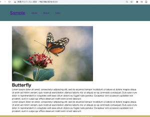
<body>
<div class="wrapper">
	<header>
		<h1 class="headline">
			<a href="">Sample</a>
		</h1>
		<ul class="nav-list">
			<li class="nav-list-item"><a href="">Home</a></li>
			<li class="nav-list-item"><a href="">About</a></li>
			<li class="nav-list-item"><a href="">Topic</a></li>
		</ul>
	</header>
	<div class="main">
	<img src="butterfly.jpg">
	<h1>Butterfly</h1>
	<p>Lorem ipsum dolor sit amet, consectetur adipiscing elit, sed do eiusmod tempor incididunt ut labore et dolore magna aliqua. Ut enim ad minim veniam, quis nostrud exercitation ullamco laboris nisi ut aliquip ex ea commodo consequat. Duis aute irure dolor in reprehenderit in voluptate velit esse cillum dolore eu fugiat nulla pariatur. Excepteur sint occaecat cupidatat non proident, sunt in culpa qui officia deserunt mollit anim id est laborum.</p>
	<p>Lorem ipsum dolor sit amet, consectetur adipiscing elit, sed do eiusmod tempor incididunt ut labore et dolore magna aliqua. Ut enim ad minim veniam, quis nostrud exercitation ullamco laboris nisi ut aliquip ex ea commodo consequat. Duis aute irure dolor in reprehenderit in voluptate velit esse cillum dolore eu fugiat nulla pariatur. Excepteur sint occaecat cupidatat non proident, sunt in culpa qui officia deserunt mollit anim id est laborum.</p>

	</div>
	<footer>
		<ul class="footer-menu">
			<li>home |</li>
			<li>about |</li>
			<li>service |</li>
			<li>Contact Us</li>
		</ul>
		<p>&copy; All rights reserved by Sample</p>
	</footer>
</div>
</body>
* {
	margin:0; padding:0;
}
.wrapper {
	min-height: 100vh;
	position:relative;
	padding-bottom: 120px;
	box-sizing: border-box;
}
header {
	height: 100px;
	width: 100%;
	padding: 15px 0;
	background-color: #337079;
	color: white;
	margin-top: 0px;
	position: fixed;
}
header .headline {
	line-height: 100px;
	float: left;
	font-size: 30px;
	margin-left: 100px;
}
.nav-list {
	line-height: 100px;
	float: left;
	margin-left: 30px;
	list-style:none;
}
.nav-list-item {
	list-style: none;
	display: inline-block;
	margin: 0 20px;
}
.main {
	width: 80vw;
	padding-top: 170px;
	margin: 0px auto;
}
footer {
	width: 100%;
	height: 100px;
	background-color: #cab64a;
	color: #fff;
	text-align: center;
	position: absolute;
	bottom:0;
}
ul.footer-menu li {
	display: inline;
}

レポジトリに登録しておこう。

[CSS] cssでのvwとは?

cssの中でvwってよく見ますが、vwって何でしょう?
vw: viewport width -> 幅に対する割合、100がマックス
vh: viewport height -> 高さに対する割合

	<style>
		img {
			display: inline-block;
			margin:auto;
			width: 50vw;
		}
	</style>
	<div class="container">
		<img src="/img/test.jpg">
	</div>

フォルクスワーゲンの事じゃないのね。。
VW、cssまで進出して凄いと思ってたが、違った様だ。

[CSS] transitionとは

CSSトランジションとは、CSSプロパティが変化する際のアニメーション速度を操作する

	<style>
		.sample {
			border: 1px solid #ccc;
			border-radius: 5px;
			width: 150px;
			height: 60px;
			line-height: 60px;
			font-weight: bold;
			text-align: center;
			color: green;
			box-shadow: 20px 10px 2px #8D9EB8;
			transition: 0.5s;
		}
		.sample:hover {
			color: orange;
			box-shadow: -20px 10px 5px #8D9EB8;
		}
	</style>
	<div class="container">		
		<div class="sample">Sample</div>		
	</div>

transitionの値を2sとか0.5sとか変えると、動きも変わる。

なるほど、アニメーションの動きは、ここで制御しとるんか。

[CSS] 画像の上に文字を乗せる方法

ボタン画像の上に文字を乗せて表示したい。
-> 画像の上に文字を乗せる方法を理解する。

<div class="sample">
			<img src="img/sky.jpg">
			<p>SUNSET</p>
		</div>

position: relativeとする。

<style>
    	.sample {
    		position: relative;
    	}
    	.sample p {
    		position: absolute;
    		color: red;
    		top: 5px;
    		left: 5px;
    	}
    </style>

<div class="container">
		<div class="sample">
			<img src="img/sky.jpg">
			<p>SUNSET</p>
		</div><br>
		<div class="sample">
			<img src="img/sky.jpg">
			<p>SUNSET2</p>
		</div>
	</div>

画像の上に文字が乗りました。

なるほど、理解した。背景画像とは別に、こういうことができるんやな。

[CSS] CSSファイルが複数ある時のネーミング

CSSファイルの分割方法

default.css リセットのCSS・基本スタイルとなるCSSを記述しています。
common.css レイアウト・ページ独自のCSSまで全て記載
index.css トップページのCSS
about.css aboutディレクトリのCSS
product.css productディレクトリのCSS
news.css newsディレクトリのCSS

なるほど、ページ名でcssファイルを作るのね。
てっきりstyle1.css, style2.cssで行こうかと思ってた。。。
これは滅茶苦茶恥ずかしい。。

[CSS] position:stickyで固定表示したい時

    <style>
    	table {
            width: 100%;
        }
        th, td {
            height: 300px;
            vertical-align: middle;
            padding: 0 15px;
            border: 1px solid #ccc;
        }
        .fixed01 {
            position: sticky;
            top: 0;
            color: #FFF;
            background: #333;
            &:before{
                content: "";
                position: absolute;
                top: -1px;
                left: -1px;
                width: 100%;
                height: 100%;
                border: 1px solid #ccc;
            }
        }
    </style>
</head>
<body>
	<div class="container">
		<table>
            <tr>
                <th class="fixed01">見出し</th>
                <th class="fixed01">見出し</th>
                <th class="fixed01">見出し</th>
            </tr>
            <tr>
                <td>テキスト</td>
                <td>テキスト</td>
                <td>テキスト</td>
            </tr>
            <tr>
                <td>テキスト</td>
                <td>テキスト</td>
                <td>テキスト</td>
            </tr>
        </table>
	</div>

「position: sticky;」は「指定された場所までいくと固定」される仕様

なるほど。。

[font-family]OSのシステムフォントとfont-familyの設定

-Windows 8.1以降
Yu Gothic
Yu Gothic UI
Segoe UI

-Mac OS EI caption以降/ iOS
Hiragino Sans
Sanfrancisco

-Android
Noto Sans CJK JP
Roboto

<style>
    	body {
            font-family: "Arial", "メイリオ";
        }
    </style>

<style>
    	body {
            font-family: sans-serif, "Helvetica Neue";
        }
    </style>

Helvetica Neue
-> mac のみ

ゴシック系

font-family: "Hiragino Sans W3", "Hiragino Kaku Gothic ProN", "ヒラギノ角ゴ ProN W3", "メイリオ", Meiryo, "MS Pゴシック", "MS PGothic", sans-serif;

なんで、font-familyで書体を複数設定しているか全然わからなかったけど、それぞれのOSで書式がないときに厳密に指定するためなのね。

何年Webやってんだ、って感じだが、やっと理解できた。

[CSS Grid] グリッドレイアウトを使ってみる

CSS Gridを推奨されたので、試してみたい。

– コンテナ
display: grid; または display: inline-grid;を使うことでGrid Layoutのコンテナになる。

<!DOCTYPE html>
<html lang="en">
<head>
	<meta charset="UTF-8">
	<title>Document</title>
	<meta name="viewport" content="width=device-width, initial-scale=1, shrink-to-fit=no">
    <!-- <link rel="stylesheet" href="https://maxcdn.bootstrapcdn.com/bootstrap/4.0.0-beta.2/css/bootstrap.min.css"> -->
    <style>
    	.grid-container {
    		display:grid;
    		grid-template-rows: 100px 50px;
    		grid-template-columns: 150px 1fr;  /* frは残りの幅 */
    	}
    	#itemA {
			grid-row: 1 / 3;
			grid-column: 1 / 2;
			background: #f88;
    	}
    	#itemB {
			grid-row: 1 / 3;
			grid-column: 2 / 3;
			background: #8f8;
    	}
    	#itemC {
			grid-row: 2 / 3;
			grid-column: 2 / 3;
			background: #88f;
    	}
    	
    </style>
</head>
<body>
	<div class="grid-container">
		<div id="itemA">A</div>
		<div id="itemB">B</div>
		<div id="itemC">C</div>
	</div>
	<script>
	</script>
</body>
</html>

概念はわかった。次行こう。

[background-image] 背景画像を表示する

html

<!DOCTYPE html>
<html lang="en">
<head>
	<meta charset="UTF-8">
	<title>Document</title>
	<meta name="viewport" content="width=device-width, initial-scale=1, shrink-to-fit=no">
    <link rel="stylesheet" href="https://maxcdn.bootstrapcdn.com/bootstrap/4.0.0-beta.2/css/bootstrap.min.css">
    <style>
    	html {
    		height: 100%;
		}

		body {
		    height: 100%;
		    margin: 0;
		}
    	.container {
    		height: 100%;
    		background-image: url('img/sky.jpg');
    		background-color:rgba(255,255,255,0.8);
    		background-blend-mode:lighten;
    		background-repeat: no-repeat;
    		background-position: center 20px;
    	}
    	
    </style>
</head>
<body>
	<div class="container col-md-12">
		<h1 class="text-center">背景画像テスト</h1>
	    <p>テキストが入りますテキストが入ります</p>
	</div>
	<script>
	</script>
</body>
</html>

なるほど

[CSS] object-fitで画像のアスペクト比を変更せずに表示する

異なる画像サイズを一定サイズのカードで表示したい。元画像をそのまま指定したheight, widthで表示した場合、縦長、横長の画像は圧縮されてしまう。どうしたら良いか。

昔、先輩に教わったのだが、システムでは表示する際にデータを装飾することはあっても、基本的に元データそのものを加工・変更してはいけない。

ということで、表示を揃えるためにアップロードした画像をサーバーサイド側で切り抜くのは気が引けていた。
少し調べたら、CSSのobject-fitでアスペクト比を維持したまま処理できるらしい。

contain: アスペクト比を維持したままボックスに収まるよう拡大縮小
cover: アスペクト比を維持したまま、コンテンツボックスを埋めるよう拡大縮小

<!DOCTYPE html>
<html lang="en">
<head>
	<meta charset="UTF-8">
	<title>Document</title>
	<style>
		.contain img {
			width: 200px;
  			height: 150px;
  			object-fit: contain;
		}
		.cover img {
			width: 200px;
  			height: 150px;
  			object-fit: cover;
		}
		.fill img {
			width: 200px;
  			height: 150px;
  			object-fit: fill;
		}
	</style>
</head>
<body>
	<div class="contain">
		<img src="img/bridge1.jpg"><br>
		<img src="img/bridge2.jpg">
	</div>
	<br>
	<div class="cover">
		<img src="img/bridge1.jpg"><br>
		<img src="img/bridge2.jpg">
	</div>
	<br>
	<div class="fill">
		<img src="img/bridge1.jpg"><br>
		<img src="img/bridge2.jpg">
	</div>
	<script>
	</script>
</body>
</html>

coverだと、画像が切れる恐れがあるから、containが一番しっくり来るな。