【Rust】AxumでCSS, JSなどstaticファイルを使いたい時

tower-http = { version = “0.6.2”, features = [“fs”] }

staticフォルダにcssファイルを置きます。
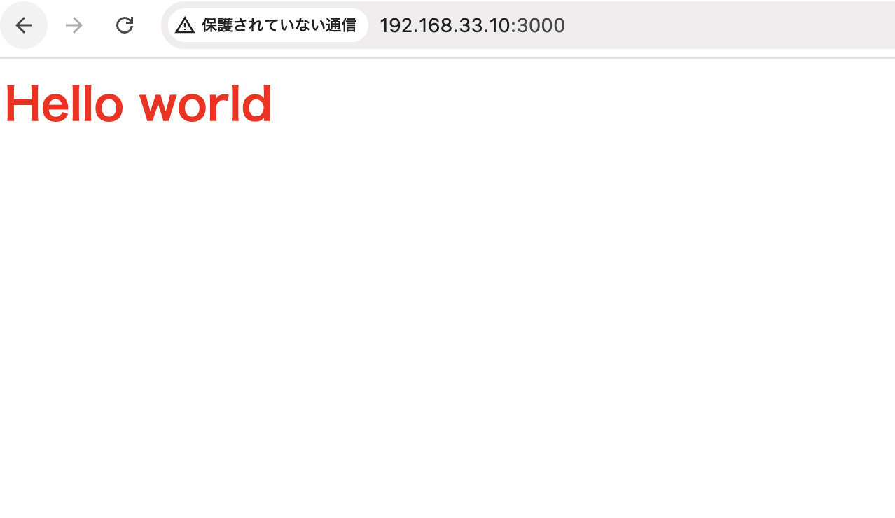
static/styles.css

1
2
3
h1 {
    color:red;
}

template/test.html

1
2
3
4
5
<head>
    <title>title</title>
    <link rel="stylesheet" href="styles.css">
</head>
<h1>Hello world</h1>

main.rs

1
2
3
4
5
6
7
8
9
10
11
12
13
14
15
16
17
18
19
20
21
22
23
24
25
26
27
28
29
use tower_http::services::{ServeDir, ServeFile};
use axum::{
    routing::get,
    Router,
};
 
#[tokio::main]
async fn main() {
 
    let serve_dir = ServeDir::new("static").not_found_service(ServeFile::new("static"));
 
    let app = Router::new()
        .route("/", get(handle_index))
        .nest_service("/static", serve_dir.clone())
        .fallback_service(serve_dir);
 
    let listener = tokio::net::TcpListener::bind("0.0.0.0:3000").await.unwrap();
    axum::serve(listener, app).await.unwrap();
}
 
async fn handle_index()-> axum::response::Html<String> {
    let tera = tera::Tera::new("templates/*").unwrap();
 
    let mut context = tera::Context::new();
    context.insert("title", "Index page");
 
    let output = tera.render("test.html", &context);
    axum::response::Html(output.unwrap())
}

なるほど、これでCSSもjsも自由にコーディングできますね。

[BlumaCSS] ul liで黒点を表示

1
2
3
4
5
6
7
8
9
10
<ul>
    <li><a href="">2021/12/10</a></li>
    <li><a href="">2021/12/10</a></li>
    <li><a href="">2021/12/10</a></li>
    <li><a href="">2021/12/10</a></li>
    <li><a href="">2021/12/10</a></li>
    <li><a href="">2021/12/10</a></li>
    <li><a href="">2021/12/10</a></li>
    <li><a href="">2021/12/10</a></li>
</ul>

これだけだと、黒点が表示されないので、class=”content”で囲む

1
2
3
4
5
6
7
8
9
10
11
12
<div class="content">
<ul>
    <li><a href="">2021/12/10</a></li>
    <li><a href="">2021/12/10</a></li>
    <li><a href="">2021/12/10</a></li>
    <li><a href="">2021/12/10</a></li>
    <li><a href="">2021/12/10</a></li>
    <li><a href="">2021/12/10</a></li>
    <li><a href="">2021/12/10</a></li>
    <li><a href="">2021/12/10</a></li>
</ul>
</div>

なるほどー

[BlumaCSS] paginationを実装したい

blumaでpaginationを実装したい

1
2
3
4
5
6
7
8
9
10
11
12
13
<nav class="pagination is-centered" role="navigation" aria-label="pagination">
    <a class="pagination-previous">Previous</a>
    <a class="pagination-next">Next page</a>
    <ul class="pagination-list">
        <li><a class="pagination-link" aria-label="Goto page 1">1</a></li>
        <li><span class="pagination-ellipsis">&hellip;</span></li>
        <li><a class="pagination-link"aria-label="Goto page 3">3</a></li>
        <li><a class="pagination-link is-current" aria-label="Page 4" aria-current="page">4</a></li>
        <li><a class="pagination-link"aria-label="Goto page 5">5</a></li>
        <li><span class="pagination-ellipsis">&hellip;</span></li>
        <li><a class="pagination-link" aria-label="Goto page 7">7</a></li>
    </ul>
</nav>

CSSを一切書かずに事足りてしまうのが凄い

goでどうやって書くのかわからんが、まあ進みましょう。

HTML内でソースコードをhighlightさせたい

1
2
3
4
5
6
// header
 
// footer
  <script>hljs.initHighlightingOnLoad();</script>

bluma cssを使っていると、paddingが設定されているので、0で!importantで設定する

1
2
3
4
5
6
7
pre {
  margin: 0 0;
  padding: 0 !important;
  border-radius: 0px;
  white-space: pre-wrap;
  max-width: 100%;
}

### 使い方
preとcodeで囲う

1
2
3
4
5
6
7
8
9
10
11
        <h6 class="has-text-weight-medium">Result</h6>
        <pre><code>{
  "data": {
    "speech": {
      "id": 2,
      "text": "  びっくりしました。\n",
      "time": "2021/11/01 15:04:12"
    }
  }
}
        </code></pre>

highlightの箇所があってませんが、まあそれらしく表示されているのでOKとしましょう。

[CSS] width 100%で縦横比を固定

heightを0にして、padding-topを%で指定する

Sass

1
2
3
4
5
6
.v-box {
    width: 100%;
    height: 0;
    padding-top:75%;
    background-color: gray;
}

html

1
2
3
4
5
<div class="columns">
                <div class="column">Ch1<br><div class="v-box"></div><p>Lorem ipsum dolor sit amet, consectetur adipiscing elit</p></div>
                <div class="column">Ch2<br><div class="v-box"></div><p>Lorem ipsum dolor sit amet, consectetur adipiscing elit</p></div>
                <div class="column">Ch3<br><div class="v-box"></div><p>Lorem ipsum dolor sit amet, consectetur adipiscing elit</p></div>
            </div>

なるほど

bluma CSSでヘッダー&メニュー作成

1
2
3
4
5
6
7
8
9
10
11
12
13
14
15
16
17
18
19
20
21
22
23
24
25
26
27
28
29
30
31
32
33
34
35
36
37
38
39
40
41
42
43
44
45
46
47
48
49
50
51
52
53
54
55
56
57
58
59
60
61
62
63
64
65
66
67
68
69
70
71
72
73
74
75
76
77
78
79
80
81
82
83
84
85
86
87
88
89
90
91
92
93
94
95
96
97
98
99
100
101
102
103
104
105
106
107
108
109
110
111
112
113
114
115
116
117
118
119
120
121
122
123
124
125
126
127
128
129
130
131
132
133
134
135
136
137
138
139
140
141
142
143
144
145
146
147
148
149
150
151
152
<!DOCTYPE html>
<html lang="en">
<head>
    <meta charset="UTF-8">
    <meta name="viewport" content="width=device-width, initial-scale=1.0">
    <title>Document</title>
    <link rel="stylesheet" href="css/style.css">
    <link rel="stylesheet" href="https://cdn.jsdelivr.net/npm/bulma@0.9.3/css/bulma.min.css">
    <link rel="stylesheet" href="https://use.fontawesome.com/releases/v5.15.1/css/all.css" integrity="sha384-vp86vTRFVJgpjF9jiIGPEEqYqlDwgyBgEF109VFjmqGmIY/Y4HV4d3Gp2irVfcrp" crossorigin="anonymous">
</head>
<body>
    <div id="app">
 
    <nav class="navbar" role="navigation" aria-label="main navigation">
    <div class="navbar-brand">
        <a class="navbar-item" href="/home" style="font-size:1.5em;font-weight:bold;">
          <!-- <img src="https://bulma.io/images/bulma-logo.png" width="112" height="28"> -->
          Speech Recognition Demo
        </a>
 
        <a role="button" class="navbar-burger" aria-label="menu" aria-expanded="false" data-target="">
          <span aria-hidden="true"></span>
          <span aria-hidden="true"></span>
          <span aria-hidden="true"></span>
        </a>
    </div>
 
    <div id="" class="navbar-menu">
    <!-- <div class="navbar-start">
      <a class="navbar-item">
        Home
      </a>
      <a class="navbar-item">
        Documentation
      </a>
    </div> -->
 
        <div class="navbar-end">
          <div class="navbar-item">
            <div class="navbar-item has-dropdown is-hoverable">
            <a class="navbar-link">
              Language
            </a>
 
            <div class="navbar-dropdown">
              <a class="navbar-item">
                English
              </a>
              <a class="navbar-item">
                Chinese
              </a>
              <a class="navbar-item">
                Japanase
              </a>
            </div>
          </div>
            <div class="buttons">
              <a class="button is-light">
                Logout
              </a>
            </div>
          </div>
        </div>
      </div>
    </nav>
 
    <section class="main-content columns is-fullheight">
    <aside class="column is-3 is-narrow-mobile is-fullheight section is-hidden-mobile">
    <p class="menu-label is-hidden-touch">MENU</p>
    <ul class="menu-list">
      <li>
        <a href="/home" class="">
          <span class="icon"><i class="fa fa-home"></i></span> Home
        </a>
      </li>
      <li>
        <a href="#" class="">
          <span class="icon"><i class="fa fa-table"></i></span> Channel
        </a>
 
        <ul>
          <li>
            <a href="#">
              <span class="icon is-small"><i class="fa fa-link"></i></span> Ch1
            </a>
          </li>
          <li>
            <a href="#">
              <span class="icon is-small"><i class="fa fa-link"></i></span> Ch2
            </a>
          </li>
          <li>
            <a href="#">
              <span class="icon is-small"><i class="fa fa-link"></i></span> Ch3
            </a>
          </li>
        </ul>
      </li>
      <li>
        <a href="#" class="">
          <span class="icon"><i class="fa fa-id-card"></i></span> MyPage
        </a>
      </li>
      <li>
        <a href="#" class="">
          <span class="icon"><i class="fa fa-file-alt"></i></span> Document
        </a>
      </li>
      <li>
        <a href="#" class="">
          <span class="icon"><i class="fa fa-comments"></i></span> Chat room
        </a>
      </li>
    </ul>
  </aside>
     
 
    <div class="container column is-9">
        <div class="section">
            <div class="card">
                <div class="card-header"><p class="card-header-title">Header</p></div>
                <div class="card-content"><div class="content">Content</div></div>
            </div>
            <br>
 
            <div class="card">
                <div class="card-header"><p class="card-header-title">Header</p></div>
                <div class="card-content"><div class="content">Content</div></div>
            </div>
            <br>
 
            <div class="columns">
                <div class="column">Column1</div>
                <div class="column">Column2</div>
                <div class="column">Column3</div>
            </div>
        </div>
 
    </div>
 
    </section>
    <footer class="footer is-hidden">
        <div class="container">
            <div class="content has-text-centered">
                <p>Hello</p>
            </div>
        </div>
    </footer>
    </div>
    <script src="bundle.js"></script>
</body>
</html>

うん、いい感じです

bluma CSSでLoginページを作成

1
2
3
4
5
6
7
8
9
10
11
12
13
14
15
16
17
18
19
20
21
22
23
24
25
26
27
28
29
30
31
32
33
34
35
36
37
<div class="hero is-fullheight is-primary">
        <div class="hero-body">
            <div class="container has-text-centered">
                <div class="column is-8 is-offset-2">
                    <h3 class="title has-text-white">Speech Recognition Demo</h3>
                    <hr class="login-hr">
                    <p class="subtitle has-text-white">Login</p>
                    <div class="box">
                        <!-- <div class="box">
                            <img src="img/login.png">
                        </div> -->
                        <div class="title has-text-grey is-5">Please enter your email and password.</div>
                        <form>
                            <div class="field">
                                <div class="control">
                                    <input class="input is-large" type="email" placeholder="Email" autofocus="">
                                </div>
                            </div>
                            <div class="field">
                                <div class="control">
                                    <input class="input is-large" type="password" placeholder="Password">
                                </div>
                            </div>
                            <button class="button is-block is-danger is-large is-fullwidth">Login</button>
                        </form>
                        <br>
                        <p class="has-text-grey">
                            <a href="">Sign Up</a> &nbsp;&nbsp;
                            <a href="">Forgot Password</a> &nbsp;&nbsp;
                            <a href="">Need Help?</a>
                        </p>
                    </div>
                </div>
 
            </div>
        </div>
    </div>

bootstrapにはない体験ができますね。

動画背景のHTML・CSSを作る

1
2
3
4
5
6
7
8
9
10
11
12
13
14
15
16
17
18
19
<!DOCTYPE html>
<html lang="en">
<head>
    <meta charset="UTF-8">
    <meta name="viewport" content="width=device-width, initial-scale=1.0">
    <title>Hpscript</title>
    <meta name="description" content="Hpscript provides comprehensive software services of full commitment to help you achieve your goals at any stage.">
    <link rel="stylesheet" type="text/css" href="css/video-styles.css">
    <link rel="shortcut icon" href="favicon.ico">
</head>
<body>
    <header id="header">
        <h1>Hpscript</h1>
        <div id="video-area">
            <video id="video" src="audio/video.mp4" webkit-playsinline playsinline muted autoplay loop></video>
        </div>
    </header>
</body>
</html>
1
2
3
4
5
6
7
8
9
10
11
12
13
14
15
16
17
18
19
20
21
22
23
24
25
26
27
28
29
30
31
32
33
34
35
36
37
38
39
@charset "utf-8";
 
#header {
    position: relative;
    height: 100vh;
}
 
#video-area {
    position: fixed;
    z-index: -1;
    top: 0;
    right: 0;
    left: 0;
    bottom: 0;
    overflow: hidden;
}
 
#video {
    position: absolute;
    z-index: -1;
    top: 50%;
    left: 50%;
    transform: translate(-50%, -50%);
    width: 177.77777778vh;
    height: 56.25vw;
    min-height: 100%;
    min-width: 100%;
}
h1 {
    position: absolute;
    top: 50%;
    left: 50%;
    transform: translateY(-50%) translateX(-50%);
    color: #fff;
    text-shadow: 0 0 15px #666;
}
a {
    color: #fff;
}

よっしゃあ、次はreactやな

marguee.jsを使わずCSSで文字を動かす

HTML

1
2
3
4
5
<div class="video">
      <div class="narrate">
        <p class="ticker" data-duplicated='false'>The Boston Celtics have signed center Robert Williams III to a contract extension, the team announced today. </p>
      </div>
    </div>

CSS

1
2
3
4
5
6
7
8
9
10
11
12
13
14
15
16
17
18
19
20
21
22
23
24
25
26
27
28
29
30
31
32
33
34
35
36
37
38
39
40
41
html {
    height: 100%;
}
body {
    height: 100%;  
}
.video {
    height: 100%;
    background: url(../img/nba.jpg) no-repeat;
    background-size: 80% auto;
    background-position: center;
 
}
.narrate {
    position: absolute;
    bottom: 10px;  
    overflow:hidden;
}
p {
    display: inline-block;
    color: #ffffff;
    font-size: 36pt;
    letter-spacing: 4px;
    text-shadow:
       2px  2px 0px #003366,
      -2px  2px 0px #003366,
       2px -2px 0px #003366,
      -2px -2px 0px #003366,
       2px  0px 0px #003366,
       0px  2px 0px #003366,
      -2px  0px 0px #003366,
       0px -2px 0px #003366;
    font-size: 15px;
    animation: flowing 15s linear 1
    transform:translateX(100%); 
}
 
@keyframes flowing {
100% {
transform:translateX(-100%);
}

jQueryのmarquee.jsを使う場合

1
2
3
4
5
6
7
8
9
10
11
<script
  integrity="sha256-/xUj+3OJU5yExlq6GSYGSHk7tPXikynS7ogEvDej/m4="
  crossorigin="anonymous"></script>
    <script src="js/marquee.js"></script>
    <script>
       $(function(){
         var $mq = $('p.ticker').marquee();
 
       });
    </script>

これでもmarqueeの動きはするが、margueeの文字がループ処理されるので、結局CSSを採用することに。
.bind(‘finished’, function(){} と $*.marquee(‘destroy’);で色々書いてみたんだが、どうやってもループになってしまう。

うーん 難しいね

[CSS] 画像を重ねて表示

1
2
3
4
5
6
7
8
9
10
11
12
13
14
15
16
17
18
19
<style>
    .good {
        width: 50px;
        height: 50px;
        color: #ffffff;
        background-color: #2779bd;
        display: flex;
        justify-content: center;
        align-items: center;
        font-size: 1.5rem;
        border-radius: 50%;
        cursor: pointer;
    }
</style>
<h1>画像を重ねて表示</h1>
<img src="img/bridge1.jpg">
<div class="good">
<i class="fa fa-thumbs-o-up" aria-hidden="true"></i>
</div>

1
2
3
4
5
6
7
8
9
10
11
12
13
14
15
16
17
18
19
20
.sample-box {
    position: relative;
    width: 300px;
}
.good {
    width: 50px;
    height: 50px;
    color: #ffffff;
    background-color: #2779bd;
    display: flex;
    justify-content: center;
    align-items: center;
    font-size: 1.5rem;
    border-radius: 50%;
    cursor: pointer;
 
    position: absolute;
    top: 85%;
    left: 140%;
}

position absoluteで、top, leftは%で表示する。

なるほど、これをTシャツでやりたい。

なるほど