
<link rel="stylesheet" href="styles.css">
<link rel="stylesheet" media="screen and (min-width:500px)" href="over500.css">
media query within a style sheet.
@media screen and (min-width: 500px){
	body { color: #F79420; }
}

@media screen and (min-width: 800px){
	body { background-color: blue; }
}
frequently used max-width and min-width
@media screen and (max-width: 500px){
	.yes {
		opacity: 1;
	}
	. no {
		opacity: 0;
	}
}
change background-color with width.
body {
	  	background-color: green;
	  }
  	  @media screen and (max-width: 400px) {
        body {
        background-color: red;
        }
      }
  	  @media screen and (min-width: 600px) {
        body {
        background-color: blue;
        }
      }
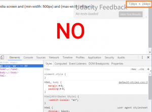
developer tool help you to decide media query