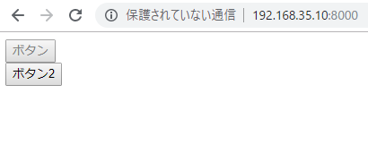
buttonにdisabledを追加します。
<button disabled>ボタン</button><br>
<button>ボタン2</button>
なるほど、こうやって表示されるのかー
ソフトウェアエンジニアの技術ブログ:Software engineer tech blog
随机应变 ABCD: Always Be Coding and … : хороший

buttonにdisabledを追加します。
<button disabled>ボタン</button><br> <button>ボタン2</button>
なるほど、こうやって表示されるのかー
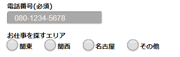
The size attribute specifies the width of the input field in characters.
The width of 17 characters is specified.
<p>
								電話番号(必須)<br>
								<input class="long-text" value="080-1234-5678" type="tel" size="17" required>
							</p>
うん、よい感じ。
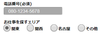
Can create a radio button by specifying type=”radio” for input element.
Enter “checked” to specify the selected state
<p id="radio">
								お仕事を探すエリア<br>
								<label><input name="job-place" class="radio" type="radio" checked>関東</label>
								<label><input name="job-place" type="radio">関西</label>
								<label><input name="job-place" type="radio">名古屋</label>
								<label><input name="job-place" type="radio">その他</label>
							</p>
ほう、いいんじゃーないでしょうか!?
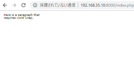
SVG elements make it possible to include external XML namespaces with graphic content rendered by different user agents. External graphic content included is subject to SVG conversion and composition.
<svg width="400px" height="300px" viewBox="0 0 400 300" xmlns="http://www.w3.org/2000/svg">
	<desc>The svg tag can write code and draw an image. Compared with bitmap data such as JPEG and PNG, even if it is enlarged, it can be displayed in a beautiful state without blurring.</desc>
	<switch>
		<foreignObject width="100" height="50" requiredExtensions="http://www.w3.org/1999/xhtml">
		<body xmlns="http://www.w3.org/1999/xhtml">
			<p>Here is a paragraph that requires word wrap</p>
		</body>
	</foreignObject>

	<text font-size="10" font-family="Verdana">
		<tspan x="10" y="10">Here is a paragraph that</tspan>
		<tspan x="10" y="20">requires word wrap.</tspan>
	</text>
</switch>
</svg>
<svg width="960px" height="1280px" viewBox="0 0 960 1280" xmlns="http://www.w3.org/2000/svg">
	<style>
	h1 {
		color:red;
	}
	</style>
	<g>
		<foreignObject x="0" y="0" width="100%" height="100%" requiredExtensions="http://www.w3.org/1999/xhtml">
		<body xmlns="http://www.w3.org/1999/xhtml">
			<p>Hello, world!</p>
		</body>
	</foreignObject>
</g>
</svg>
ん? どういこと?
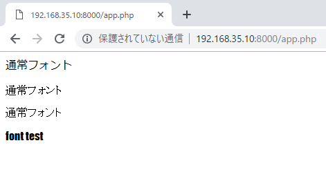
とりあえず、明朝、ゴシックで比較
<p>通常フォント</p>
<p><font face="MS P明朝">通常フォント</font></p>
<p><font face="MS Pゴシック">通常フォント</font></p>
<p><font face="Impact">font test</font></p>
全然違いますね~
しかし、これデザイナーの領域だな。。。
>重要なのは、可読性、視認性、判読性を意識しながらの「TPOに合わせたフォント選び」
なるほど、テイストによって分けるのは理解できる。。
まず、どんな文字があるのか知らないといけない。。
<!DOCTYPE html>
<meta charset="utf-8">
<style>
#errorMessage {
	color: red;
}
</style>
<form>
<div id="errorMessage"></div>

<label for="name">お名前:</label>
<input name="name" id="name" required><br>
<label for="password">パスワード:</label>
<input type="password" name="password" id="password" required><br>
<label for="passwordConfirm">パスワード(確認):</label>
<input type="password" name="confirm" id="confirm" oninput="CheckPassword(this)"><br>
<input type="submit" value="送信">
</form>
<script>
		function CheckPassword(confirm){
			var input1 = password.value;
			var input2 = confirm.value;

			if (input1 != input2){
				confirm.setCustomValidity("入力値が一致しません");
			} else{
				confirm.setCustomValidity('');
			}
		}
</script>
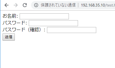
うまくいきました。
oninput=””か、なるほど。
<!DOCTYPE html>
<meta charset="utf-8">
<style>
#errorMessage {
	color: red;
}
</style>
<form>
<div id="errorMessage"></div>

<label for="name">お名前:</label>
<input name="name" id="name" required><br>
<label for="password">パスワード:</label>
<input type="password" name="password" id="password" required><br>
<label for="passwordConfirm">パスワード(確認):</label>
<input type="password" name="passwordConfirm" id="passwordConfirm" required><br>
<input type="submit" value="送信">
</form>
<script>
var form = document.forms[0];
form.onsubmit = function(){
	form.password.setCustomValidity("");

	if(form.password.value != form.passwordConfirm.value){
		form.password.setCustomValidity("パスワードと確認用パスワードが一致しません")
	}
}
form.addEventListener("invalid", function(){
	document.getElementById("errorMessage").innerHTML = "入力値にエラーがあります";
}, false);
</script>
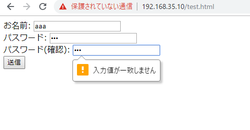
あれ? あれ?
うまくいきませんね。。
I want to display the “confirmation”, “clear” and “return” buttons within HTML form.
Here is User Interface.
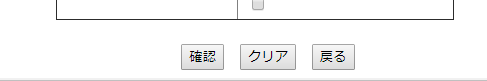
confirm: type=”submit”
clear: type=”reset”
return: type=”button” onclick=”history.back()”
<center>
		<button type="submit">確認</button> <button type="reset">クリア</button> <button type="button" onclick="history.back()">戻る</button>
	</center>
It’s easy than expected.
Markup language for creating content for mobile information terminal. It is used in EZweb which can be used with au’s mobile phone. One page is handled as “card” and a group of multiple cards is called “deck”. Data is transmitted and received on a deck basis. It is not compatible with Compact HTML which is a description language for the same portable information terminal.
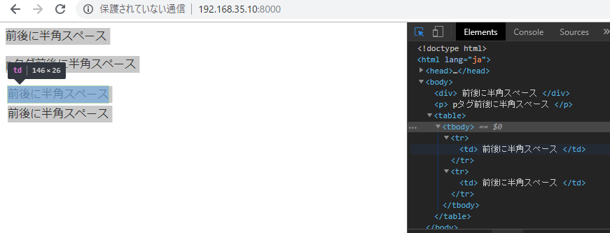
<!DOCTYPE html>
<html lang="ja">
<head>
	 <meta charset="UTF-8">
	 <title>space</title>
</head>
<body>
	<div> 前後に半角スペース </div>
	<p> pタグ前後に半角スペース </p>
	<table>
		<tr>
			<td> 前後に半角スペース </td>
		</tr>
		<tr>
			<td> 前後に半角スペース </td>
		</tr>
	</table>
</body>
</html>
ん? 文頭の半角スペースは消えるが文末の半角スペースは残ってる?
なに? 期待値とちょっと違うな。。