nowrapを加えます
<td nowrap>hogehoge</td>
nowrap追加前
nowrap追加後
2~3日、ずっと悩んでました。。
ソフトウェアエンジニアの技術ブログ:Software engineer tech blog
随机应变 ABCD: Always Be Coding and … : хороший

nowrapを加えます
<td nowrap>hogehoge</td>
nowrap追加前
nowrap追加後
2~3日、ずっと悩んでました。。
1.table tdのcssは
td {
  write something;
}
2. table td にclassを付けた場合
例
<td class="selected">hoge</td>
cssは、
td.selected {
   write something;
}
3.table tdの中にlink(aタグ)のcss
td a{
  write something;
}
4.table classを付けたtdの中のlink(aタグ)のcss
<td class="selected"><a href="?param=hoge">foo</a></td>
cssは
td.selected a{
  write something;
}
下のキャプチャのように、classをつけているtdの中のaタグのcolorを#fffにできました。
初期画面
<style>
#tbl-bdr table,#tbl-bdr td,#tbl-bdr th {
border-collapse: collapse;
border: 1px solid #000000;
}
table td{
	width:45px;
}
</style>
<br>
<div id="tbl-bdr">
<table>
<tr>
<td></td><td>9:00</td><td>9:30</td><td>10:00</td><td>10:30</td><td>11:00</td><td>11:30</td><td>12:00</td><td>13:00</td><td>13:30</td><td>14:00</td><td>14:30</td><td>15:00</td><td>15:30</td><td>16:00</td><td>16:30</td><td>17:00</td>
</tr>
<tr>
<td>松島</td><td></td><td></td><td></td><td></td><td></td><td></td><td></td><td></td><td></td><td></td><td></td><td></td><td></td><td></td><td></td><td></td>
</tr>
<tr>
<td>小野</td><td></td><td></td><td></td><td></td><td></td><td></td><td></td><td></td><td></td><td></td><td></td><td></td><td></td><td></td><td></td><td></td>
</tr>
<tr>
<td>草野</td><td></td><td></td><td></td><td></td><td></td><td></td><td></td><td></td><td></td><td></td><td></td><td></td><td></td><td></td><td></td><td></td>
</tr>
</table>
</div>
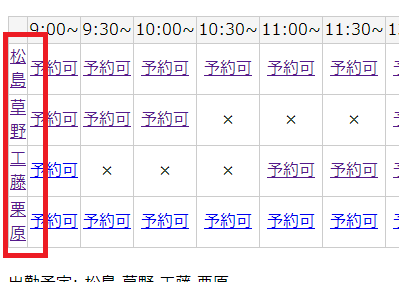
テーブルはできたんですが、ここからどうすればいいのでしょうか?
セル毎にデフォルトは〇、if文でその時間帯が開始時間と終了時間の間であれば×を計算でしょうか。
いや、予約が入っているところだけ、計算した方が速いような気がします。
なんか凄い難しいぞ。
あ、仮置きで、9:00->a 9:30->b, 10:00->c, 10:30->d .. として、aが〇か×か判定の判定をfor文で回せばいいのでしょうか? いや、for文で回すと$iと$jを入れ子で回すので、担当者のid(テーブル)を作る必要がありそうです。
あ、こういうことですかね?
$timelist = array(540, 570, 600, 630, 660, 690, 780, 810, 840, 870, 900, 930, 960, 990, 1020);
for($i=0; $i < count($timelist); $i++){
if($timelist[$i] >= $result[0]['time1'] and $timelist[$i] < $result[0]['time2']){
echo "予約あり<br>";
}else{
echo "予約なし<br>";
}
}
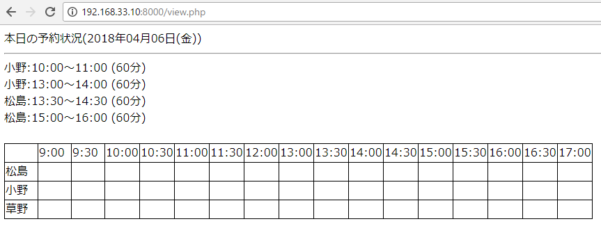
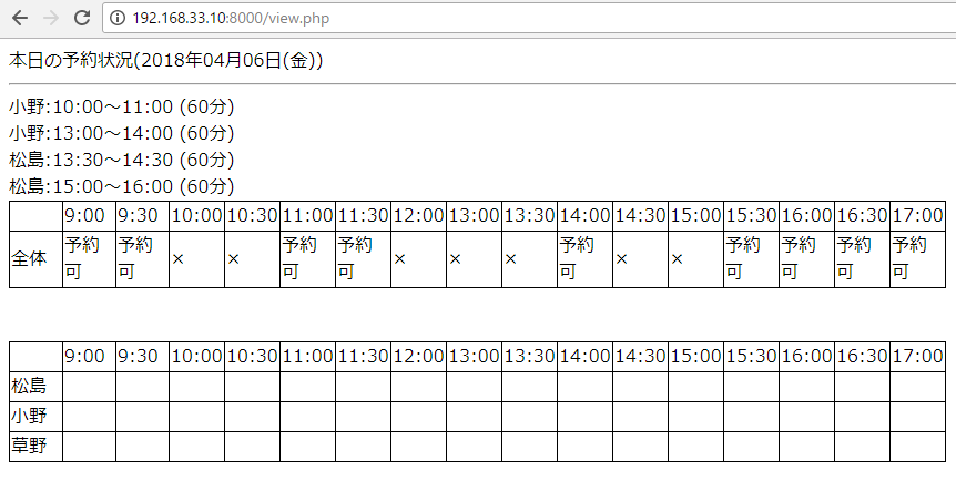
小野:10:00~11:00 (60分)
予約なし
予約なし
予約あり
予約あり
予約なし
予約なし
予約なし
予約なし
予約なし
予約なし
予約なし
予約なし
予約なし
予約なし
予約なし
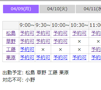
修正します。
$timelist = array(540, 570, 600, 630, 660, 690, 780, 810, 840, 870, 900, 930, 960, 990, 1020);
$list = array("予約可","予約可","予約可","予約可","予約可","予約可","予約可","予約可","予約可","予約可","予約可","予約可","予約可","予約可","予約可","予約可");

foreach($result as $value){
	for($i=0; $i < count($timelist); $i++){
	if($timelist[$i] >= $value['time1'] and $timelist[$i] < $value['time2']){
		 $list[$i] = "×";
	}
 }
}
a little close?
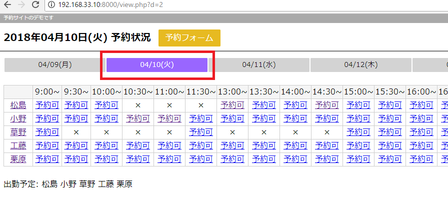
更に修正
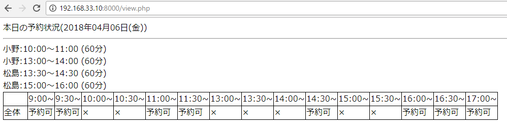
まず初期画面
mobileの場合は、1カラムで表示させたい。
amazonトップページのソースからcssを見るとどうやら、768pxと979pxで切り分けているので、メディアクエリ@mediaはひとまず768pxしたいと思います。
https://www.amazon.co.jp
@media (max-width:767px){.a-visible-phone{display:inherit!important}.a-hidden-phone{display:none!important}.a-hidden-desktop{display:inherit!important}.a-visible-desktop{display:none!important}}@media (min-width:768px) and (max-width:979px){.a-visible-tablet{display:inherit!important}
max-width:767pxの時は、float:leftとfloat:rightを解除します。
@media screen and (min-width: 767px) {
#content{
width:800px;
margin:10px auto;
}
fieldset{
border:1px #C0C0C0 solid;
}
h1 {
display:inline;
}
#img {
height:28px;
}
.form1{
margin-top: 1em;
padding: .5em;
size:80;
}
.submit1{
margin-top: 1em;
padding: .3em;
}
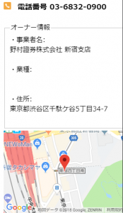
#owner{
width:52%;
float:left;
}
#map{
width: 45%;
float:right;
height: 200px;
}
}
@media screen and (max-width: 767px) {
#content{
width:75%;
margin:5px auto;
}
fieldset{
border:1px #C0C0C0 solid;
}
h1 {
display:inline;
font-size:18px;
}
#img{
height:18px;
}
.form1{
margin-top: 1em;
padding: .5em;
size:25;
}
.submit1{
margin-top: 1em;
padding: .3em;
}
#owner{
width:99%;
}
#map{
width: 99%;
margin-top:5px;
height: 200px;
}
}
一応、レスポンシブルになりました。
min768px
max767px
戦後のスカイラインのデザインはかっこよかったが、やはり、デザインはその時の時代背景が出ますね。。
<style>
.submit1 {
height:30px;
margin-top:5px;
padding-right:15px;
padding-left:15px;
background-color:#0099FF;
color:#fff;
border:0px;
}
.submit1:active {
-ms-transform: translateY(2px);
-webkit-transform: translateY(2px);
transform: translateY(2px);
border-bottom: none;
}
.form2{
height:30px;
}
textarea{
padding-top:5px;
}
</style>
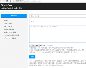
<form action="?compose=done" method="post" enctype="multipart/form-data">
<br>
<input type="text" class="form2" name="to" size="80%" value="<?php echo $to; ?>" placeholder=" 宛先 ※必須" required><br>
<br>
<input type="text" class="form2" name="subject" value="<?php echo $subject; ?>" placeholder=" 件名" size="80%"><br>
<br>
<textarea placeholder=" メッセージを入力してください ※必須" name="body" rows="12" cols="82%" required></textarea>
</p>
<input type="file" id="files" name="files[]" multiple />
<div id="caution">
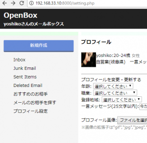
※送信できるファイルの拡張子は"gif","jpg","jpeg","png"の何れかです。<br>
※ファイル送信は最大2つまでです。3つ以上選択しても、3つ目以降は送れません。また、二つのファイルを送信する場合は、キーボードの"ctl"ボタンなどで二つ選択した状態で開いてください。</div>
<output id="list"></output>
<p>
<input type="submit" class="submit1" value="送信">
</form>
なんか、hrがしょぼいですな。。
あ、hrもcssでスタイリングできるんですね♪
hr{
	height: 2px;
	background-color: #F8F8FF;
	color: #F8F8FF;
}
割といい
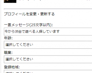
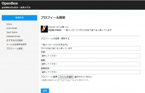
headerをつくっていきます。
.header-wrap{
	background-color:#222222;
	margin-bottom:10px;
}
.title-wrap{
   display:inline-block;
   vertical-align: bottom;
}
.title-wrap h1 {
	font-size:23px;
	padding-top:0px;
	padding-left:15px;
	margin-bottom:0px;
	color:#fff;
}
.title-wrap h2 {
	font-size:14px;
	margin-top:0px;
	padding-left:15px;
	padding-bottom:5px;
	color:#fff;
}
.out {
	display:inline;
	vertical-align: bottom;
	font-size:12px;
	float:right;
	padding-top:15px;
	padding-right:15px;
	color:#fff;
}
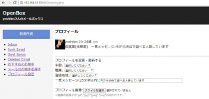
もう少し細くします。
flex-1, flex-2にヘッダーをつけます。
.side{
	height:12px;
	background-color:#E6FFE9;
}
.main{
	height:12px;
	background-color:#F5FFFA;
}
ul, li要素のlist-styleをnoneにします。
ul{
	list-style:none;
}
li{
	margin:7px;
}
まぁまぁOK
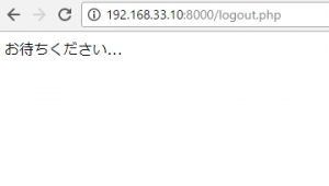
ログアウト画面の表示
<?php

require("auth.php");
$auth = new Auth();
$auth->logout();

?>
お待ちください...
<script>
setTimeout(function(){
	window.location.href = "login.php";
}, 600);
</script>
gmailと一緒で、特にスタイリングはなしでOKですね。settimeは600msくらいにしておきます。
さあ、次は、form周りでしょうか。
inlineでやりたいところですが、複数のHTMLファイルに対して共通のCSSを適用するため、外部にフォルダを作成し、そこに入れて読み込むことが一般的かと思います。
<link rel="stylesheet" type="text/css" href="asset/css/styles.css" />
多数の人間が制作に関わった場合などは、パーツによって、このclassはxxx.cssファイル、このidはyyy.cssファイルを読み込む、など、1つのページでも複数のcssファイルを読み込むことがあります。
問題は、大規模サイトで、CSSファイルを5~6個位読み込んでいて、後からチームにジョインした人が改修しようとした際に、それぞれ書き方も別々の為、なにがなんだかわからなくなる、ということがあります。
そこで、コーディングガイドラインを作成しようとなります。
では、Googleのコーディングガイドラインをみてみましょう。
– Not reccomended
<!DOCTYPE html>
<title>HTML sucks</title>
<link rel="stylesheet" href="base.css" media="screen">
<link rel="stylesheet" href="grid.css" media="screen">
<link rel="stylesheet" href="print.css" media="print">
<h1 style="font-size: 1em;">HTML sucks</h1>
<p>I’ve read about this on a few sites but now I’m sure:
  <u>HTML is stupid!!1</u>
<center>I can’t believe there’s no way to control the styling of
  my website without doing everything all over again!</center>
-recommended
<!-- Recommended -->
<!DOCTYPE html>
<title>My first CSS-only redesign</title>
<link rel="stylesheet" href="default.css">
<h1>My first CSS-only redesign</h1>
<p>I’ve read about this on a few sites but today I’m actually
  doing it: separating concerns and avoiding anything in the HTML of
  my website that is presentational.
<p>It’s awesome!
外部ファイルは一つにして、そこから読み込むことが推奨されています。その他も参考になります。
https://google.github.io/styleguide/htmlcssguide.html#CSS_Style_Rules
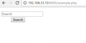
まず、スタイリングしていない状態です。
<body>
	<form action="/" name="search1" method="post">
		<dl class="search1">
			<dt><input type="text" name="search" value="" placeholder="Search"></dt>
			<dd><button>Search</button></dd>
		</dl>
</body>
	<style>
	dl.search {
		position:relative;
	}
	dl.search dt{
		margin-right:105px;
		padding:8px;
		background-color:#fff;
		border:1px solid #aaa;
	}
	dl.search dd{
		position:absolute;
		top:0;
		right:0;
	}
	dl.search dt input{
		width:100%;
		height:24px;
		line-heigh:24px;
		background:none;
		border:none;
	}
	dl.search dd {
		position:absolute;
		top:0;
		right:0;
	}
	dl.search dd button{
		display:block;
		width:100px;
		height:42px;
		color:#fff;
		line-height:40px;
		text-align:center;
		background-color:#f66;
		border:1px solid #c66;
	}
	</style>
css trigger
https://csstriggers.com/
var isSetup = setupVariables(e);
if(isSetup){
	setInterval(captureFrame.bind(self), 4);
}
else {
	setTimeout(function(){
		setupVariables(e);

		setInterval(captureFrame.bind(self), 4);
	}, 100);
}
var captureFrame = function(){
	canvas.drawImage(cameraVideo, sx /scaleFactor, sy/scaleFactor, sWidth/scaleFactor,
		sHeight/scaleFactor, dx, dy, dWidth, dHeight);

		drawOverlay(dWidth, dHeight, scaleFactor);

		if(self.onframe) self.onframe();

		coordinatesHaveChanged = false;
};
gulp serve command
[vagrant@localhost qrcode]$ gulp serve
[21:54:17] Using gulpfile ~/webapp/app/qrcode/gulpfile.js
[21:54:17] Starting 'styles'...
[21:54:18] styles all files 26.07 kB
[21:54:18] Finished 'styles' after 1.46 s
[21:54:18] Starting 'serve'...
[21:54:19] Finished 'serve' after 505 ms
[WSK] Local URL: http://localhost:3000
[WSK] External URL: http://10.0.2.15:3000
[WSK] Serving files from: .tmp
[WSK] Serving files from: app
<style tyle="text/css">
      .container {
        width: 100%;
        display: flex;
        flex-wrap: wrap;
      }
      .box {width: 150px;}
 </style>
column drop, off canvas, layout shifter, mostly fluid