Beaconとは、低消費電力の近距離無線技術「Bluetooth Low Energy」を利用した位置特定技術
GPSは人工衛星から発する電波を活用して位置情報を把握する仕組み
Beaconは信号を半径数十メートル範囲に発信する発信機、建物の中や地下でも受信できる ただし、距離が限られる
Beaconの発信情報をスマホに表示されるなどができる
出席、遅刻などをbeaconを使って管理する
社会インフラがBeaconを提供すれば、それを活用してInput, Outputが出来そうではある
ソフトウェアエンジニアの技術ブログ:Software engineer tech blog
随机应变 ABCD: Always Be Coding and … : хороший

Beaconとは、低消費電力の近距離無線技術「Bluetooth Low Energy」を利用した位置特定技術
GPSは人工衛星から発する電波を活用して位置情報を把握する仕組み
Beaconは信号を半径数十メートル範囲に発信する発信機、建物の中や地下でも受信できる ただし、距離が限られる
Beaconの発信情報をスマホに表示されるなどができる
出席、遅刻などをbeaconを使って管理する
社会インフラがBeaconを提供すれば、それを活用してInput, Outputが出来そうではある
NFCとはかざすだけで周辺機器と通信できる技術
NFCのか通用でスマホ決済が利用できる
SuicaもNFCが活用されている
アメリカのモトローラが開発、CPU内蔵で高速
マイナンバーカード、運転免許証、パスワードなどに使用
Felicaはnanaco, iD, 楽天Edyなど多くの電子マネーで使用
### NFCチップ
NFCチップ(IC)が搭載されていれば、短波HF帯(13.56MHz)を利用して、すぐ近くにあるNFC対応機器とワイヤレス通信できる。ただし、通信速度は最大424kbpsと低速
ラズパイでNFCタグを読み取る例
なるほど、ICチップの中に、idやsuicaの残高や名前などの情報を埋め込んでるのね。
電流を流して、ICチップと情報のやり取りをしている
これICチップ作ってるところの独占技術だな
Android ChromeでWeb NFCってのもあるみたい
viewportの指定で例えば以下の様に設定していたとする。
<meta content='width=device-width, initial-scale=1.0, maximum-scale=1.0, user-scalable=0, shrink-to-fit=no' name='viewport' />
user-scalable:ズームの操作
-> ユーザーがズームできるかどうかの設定。
-> 初期値はyes。yes=1,no=0。
maximum-scale 最大倍率
-> 最小拡大比率の設定。
-> デフォルトは1.6で指定可能範囲は0より大きく、10までの値。
つまり、「maximum-scale=1.0, user-scalable=0」だと、ユーザのズームを禁止しており、仕様にもよるが、多くの場合、ユーザエクスペリエンス上、望ましくないとのこと。
なるほど、プロの領域やな。
Keychain Accessを開きます。
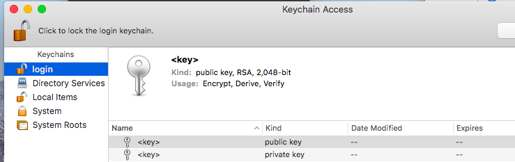
keychain accessから、certificate requestをする。
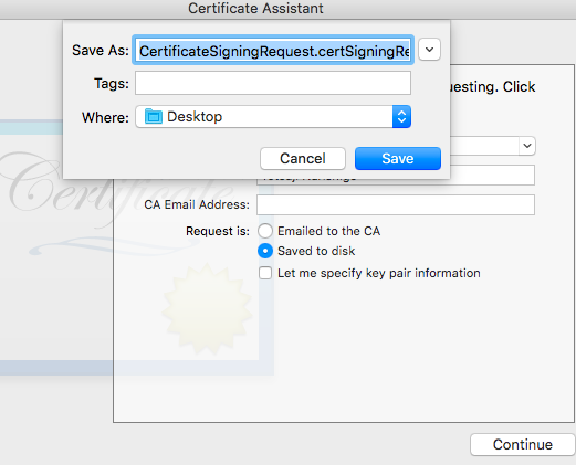
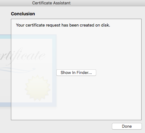
CertificateSigningRequest.certSigningRequestが出来ました。
続いてKeychain Accessからp.12を作成する。
front end, back end, mobile, data
<script>
if (navigator.onLine)
	alert("I'm online! Whoo-hoo");
</script>
check manifest file.
localStorage.setItem(‘foo’, ‘bar’);
<input type="file" accept="image/*;capture=camera">
<input type="file" accept="image/*;capture=camcorder">
<input type="file" accept="image/*;capture=microphone">
problems with file input capture
-only works on mobile
-file open button is unstylable
-different app can break the flow
navigator.getUserMedia(constraints, successCallback, errorCallback);
function openCameraPane(callback, fullscreen) {
	if (fullscreen)
		document.body.webkitRequestFullscreen();
	_myVideoCallback = callback;
	var constraints = {video: true};

	navigator.getUserMedia(constraints,successCallback,errorCallback);
}
function successCallback(stream) {
	var video = createVideoUserInterface();
	video.src = window.URL.createObjectURL(stream);

}
function snapshot(ev) {
	var video = document.querySelector('.camera-video');
	var canvas = document.querySelector('.camera-picture');
	var ctx = canvas.getContext('2d');

  ctx.drawImage(video, 0, 0);
}
MediaStreamTrack.getSources(gotSources);
<element>.requestFullscreen();
html5 geolocation API
maps, augmented reality, geocaching, nearby features
navigator.geolocation.getCurrentPosition(
	function(position){
		do_something(
			position.coords.latitude,
			position.coords.longitude )
	});
Vibration API
navigator.vibrate(1000)
<meta name="viewport" content="width=device-width">
start this tag.
<meta name="viewport" content="width=device-width,initial-scale=1">
1vmin = 1vm or 1vh, whichever is smallest
1vmax = 1vm or 1vh, whichever is largest
available media query expressions
width, height, device-width, device-height, orientation, aspect-ratio,
device-aspect-ratio, grid, color, color-index, monochrome, resolution, scan
.menu-items-grid {
    display: flex;
    flex-wrap: wrap;
    flex-direction: row;
    justify-content: space-around;
    padding: 0 1%
}

@media (orientation:portrait){
  .menu-items-grid {
    flex-direction: column;
  }
}
window.devicePixelRatio
@media (min-pixel-ratio:2){
  .pretteybackground {
    background: url('images/hires_bkg.png');
  }
}
cellular radio lifecycle
Idle -> active -> short sleep -> long sleep
-lifecycle of an HTTP request
DNS lookup -> socket connect -> HTTP request -> Data download
avoid redirect
minimize or eliminate render-blocking resources (stylesheets, fonts, unknown-size, image)
animation framework
settimeout, setInterval -> requestAnimationFrame
touch UI
hover does not rely on
use large hit target
do not disable mouse support
touch events
->touchstart, touchmove, touchend, touch cancel
Input
html5 has tel input type.
<input type="tel">
<label>
  <input type="checkbox">
  "Do you love lemurs?"
</label>
<meta name="viewport" content="width=device-width, initial-scale=1">
initial-scale indicate relationship between device independent pixel and css pixel.
<meta name="viewport" content="width=360,initial-scale=1">
prevent image overflow content
img, embed, object, video {
  max-width: 100%
}
example
<img id="owl">
#owl {
 width: 640px;
 max-width: 100%;
}
CSS/Properties
https://www.w3.org/community/webed/wiki/CSS/Properties
nav a, button {
min-width: 48px;
max-height: 48px;
}
device pixel ratio:デバイス・ピクセルとCSSピクセルの比率のこと
The device pixel ratio is the ratio between physical pixels and logical pixels. For instance, the iPhone 4 and iPhone 4S report a device pixel ratio of 2, because the physical linear resolution is double the logical linear resolution.
device pixel / hardware pixel: デバイス・端末がサポートする物理的な最小単位のピクセル。ハードウェア・ピクセルともいう。
CSS pixel:CSSで使う論理上のピクセル。デバイス・ピクセルが物理的なピクセルの数であるのに対し、CSSピクセルは論理上のピクセルの数です。
CSS properties take “length” values, such as width, margin, padding, font-size, border-width, etc.Length is a number followed by a length unit, such as 10px, 2em, etc.
A whitespace cannot appear between the number and the unit. However, if the value is 0, the unit can be omitted.For some CSS properties, negative lengths are allowed.
There are two types of length units: relative and absolute.
User agent:利用者があるプロトコルに基づいてデータを利用する際に用いるソフトウェアまたはハードウェアのこと。 特にHTTPを用いてWorld Wide Webにアクセスする、ウェブブラウザなどのソフトウェアのこと。
In computing, a user agent is software (a software agent) that is acting on behalf of a user. One common use of the term refers to a web browser telling a web site information about the browser and operating system.
Example:Mozilla/5.0 (Linux; Android 5.0; Nexus 6 Build/XXX00x) AppleWebKit/537.36 (KHTML, like Gecko) Chrome/39.0.2171.59 Mobile Safari/537.36
Google dev tool remote debugging
https://developers.google.com/web/tools/chrome-devtools/remote-debugging/
Hardware Pixel and Device Independent Pixel
With font boosting and without font boosting
ViewPortとは:「表示領域」
スケールは1、等倍で表示される
ポートレート表示時の幅は320px
ランドスケープ表示時の幅は480px以上
<!DOCTYPE html>
<html>
<head>
<meta charset="utf-8">
<meta name="viewport" content="...">
<title>title here</title>
...
</head>
<body>
...
1920 x 1980 px
DPR = 2
maximum width of a viewport is 960px