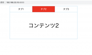
パワポの資料をHTML上でスライダーで表示したい。
jQueryの”bxslider”を使う。bxsliderはcdnで使います^^
### 前準備
パワポの各スライドをスクリーンショットでpng画像にします。
### html
slider.html
L パワポの縦横比は16:9なので、width740, height:520でOKです。
<!DOCTYPE html>
<html lang="en">
<head>
	<meta charset="UTF-8">
	<meta name="viewport" content="width=device-width, initial-scale=1.0">
	<title>Document</title>
	<script
  src="https://code.jquery.com/jquery-3.6.0.min.js"
  integrity="sha256-/xUj+3OJU5yExlq6GSYGSHk7tPXikynS7ogEvDej/m4="
  crossorigin="anonymous"></script>
	<link rel="stylesheet" href="https://cdn.jsdelivr.net/bxslider/4.2.12/jquery.bxslider.css">
	<script src="https://cdn.jsdelivr.net/bxslider/4.2.12/jquery.bxslider.min.js"></script>
	<script>
		$(document).ready(function(){
			$('.bxslider').bxSlider({
				mode:'fade',
			});
		});
	</script>
</head>
<body>
	<ul class="bxslider">
		<li><img src="img/slide1.png" width="720px" height="540" style="margin:auto; left:0; right: 0;"></li>
		<li><img src="img/slide2.png" width="720px" height="540" style="margin:auto; left:0; right: 0;"></li>
		<li><img src="img/slide3.png" width="720px" height="540" style="margin:auto; left:0; right: 0;"></li>
		<li><img src="img/slide4.png" width="720px" height="540" style="margin:auto; left:0; right: 0;"></li>
		<li><img src="img/slide5.png" width="720px" height="540" style="margin:auto; left:0; right: 0;"></li>
	</ul>
</body>
</html>

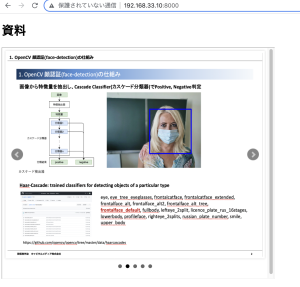
### 表示する側(html)
iframeで表示します。
<body>
	<h1>資料</h1>
	<iframe src="slider.html" seamless width="720px" height="610px"></iframe>
</body>
よっしゃあああああああああああああああ