
HTML: チャット画面をBluma CSSでinputとsubmitを書いているが、classのis-expandが横幅maxにならないので、CSSで横幅を指定する。その際に、レスポンシブルでスマホはwidth85%, desktopはwidth65%としたい。
			<div class="field is-grouped" id="newMessage">
			  <p class="control is-expanded" >
				<input type="text" id="message" class="input">
			  </p>
			  <p class="control">
			    <input type="submit" value="send" class="button is-link">
			  </p>
			</div>
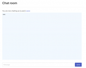
画面
### 従来のmedia queryで書く場合
style.scss: これでも動くには動くが、プログラマーとしては重複して書くのはかなり気持ちが悪い
@media screen and (min-width: 768px) {
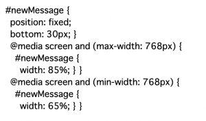
#newMessage {
position: fixed;
width:65%;
bottom: 30px;
}
}
@media screen and (max-width: 768px) {
#newMessage {
position: fixed;
width:85%;
bottom: 30px;
}
}
### Sassで変数を使って書く場合
media queryで表示を分けて書く箇所が多い場合はかなり重宝できる
$breakpoints: (
	'sm': 'screen and (max-width: 768px)',
	'md': 'screen and (min-width: 768px)',
) !default;

@mixin mq($breakpoint: md) {
	@media #{map-get($breakpoints, $breakpoint)}{
		@content;
	}
}
#newMessage {
	position: fixed;
	@include mq(sm) {
    	width: 85%
  	}
  	@include mq(md) {
    	width: 65%
  	}
	bottom: 30px;
}
webpackでコンパイルされると、以下のように出力されている
あら、 かなり良いですね~
寿司食べたい🍣